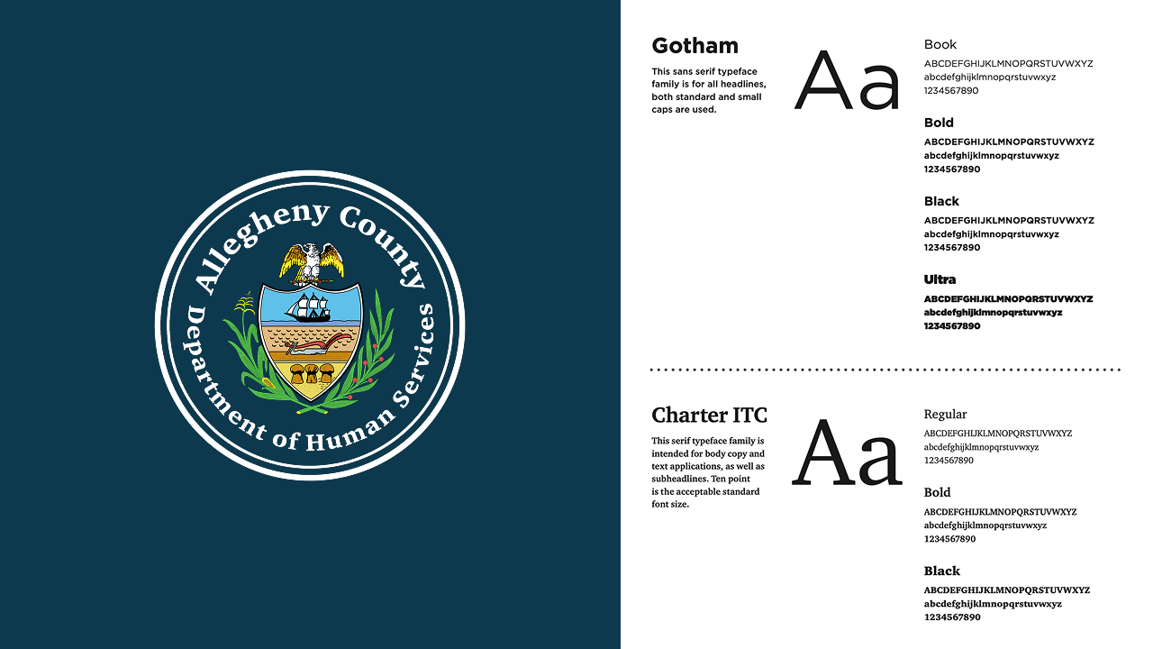
Building a Dedicated Brand

The Heart:
This government organization delivers over 300 annual community services, impacting 200,000 residents. However, a lack of recognition as a trusted, approachable resource limits service utilization. Our challenge is to strategically build a brand personality that earns loyalty and maximizes community benefit.
The Hustle:
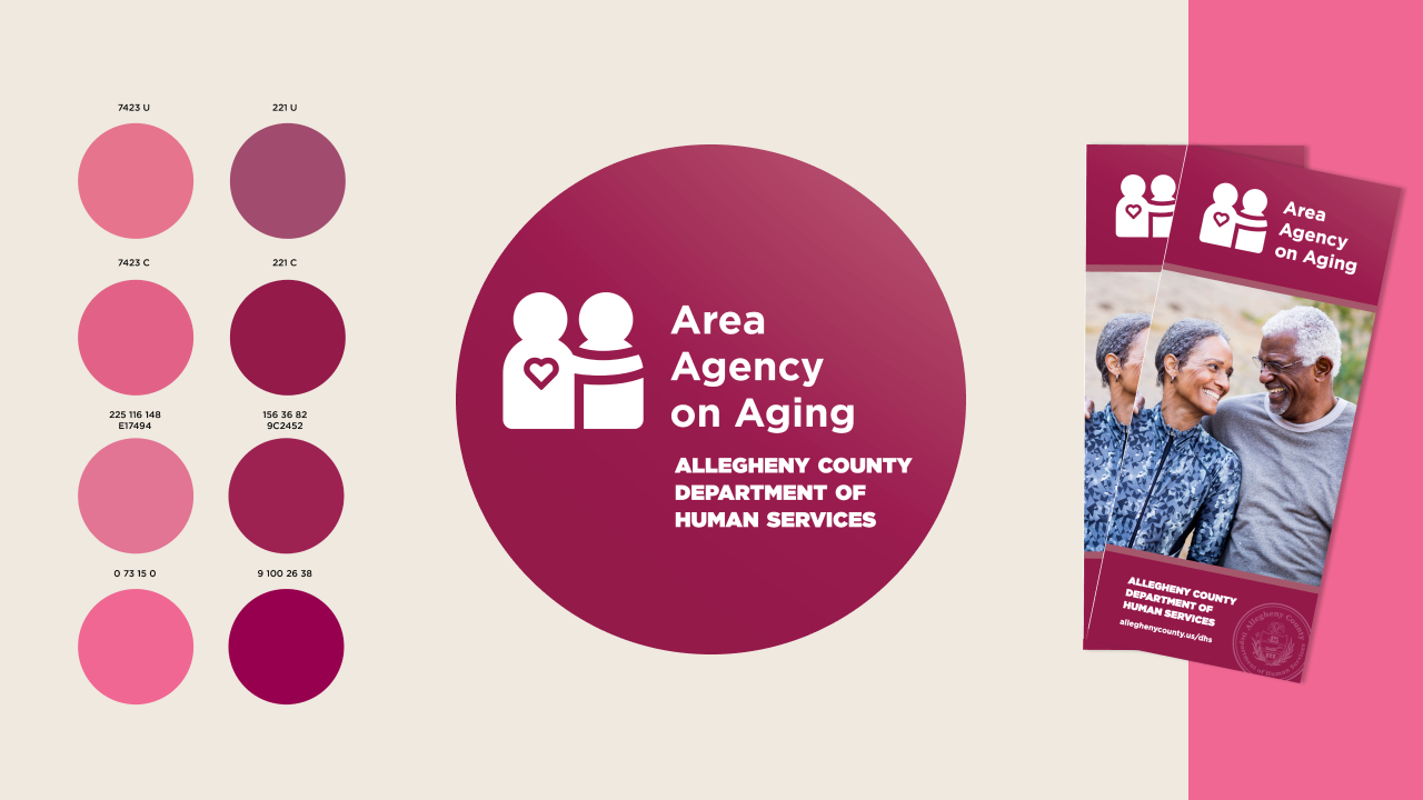
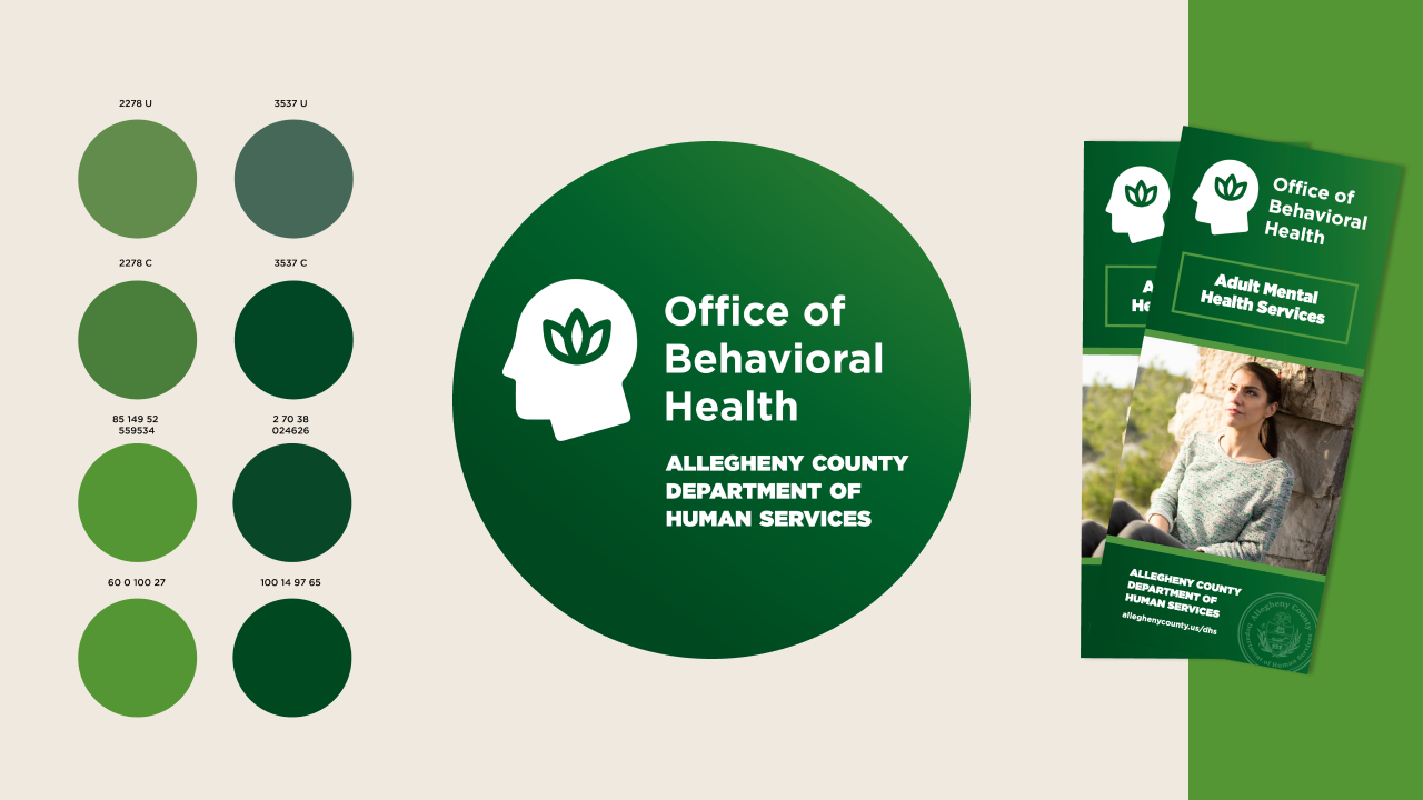
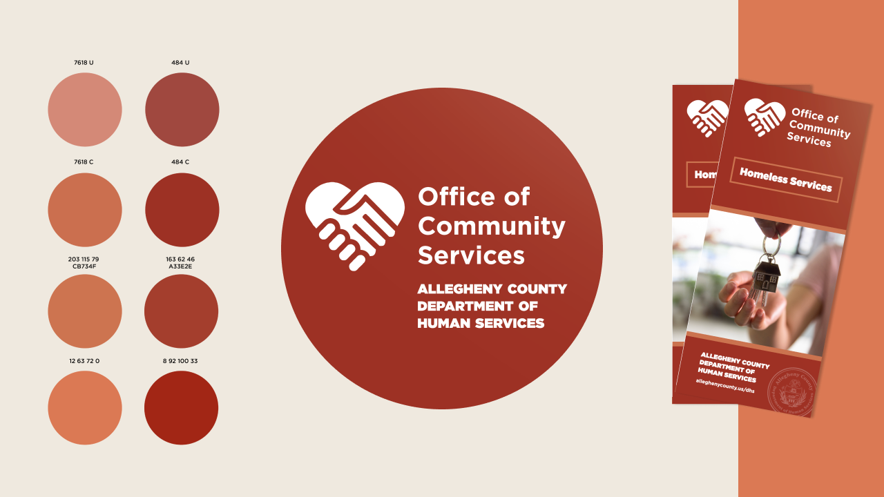
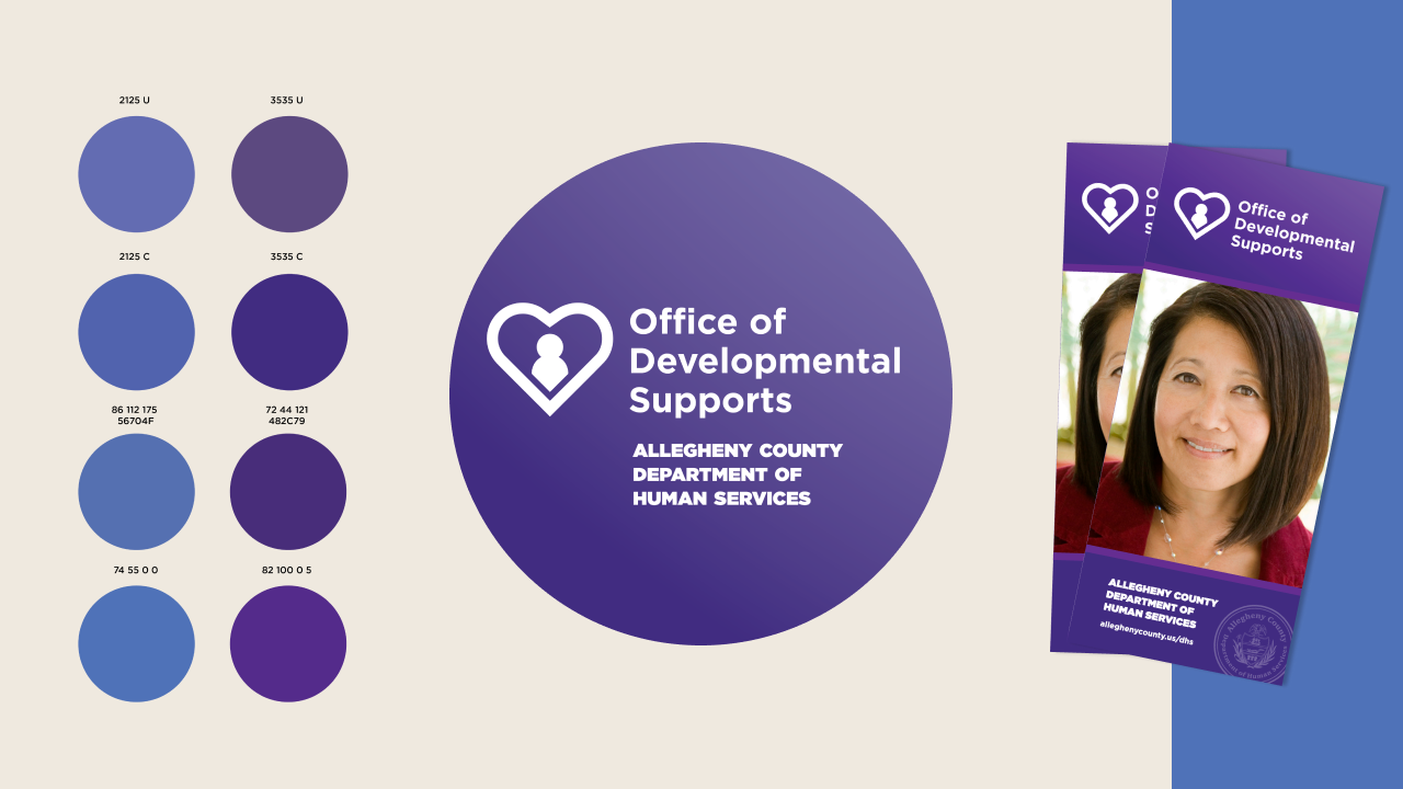
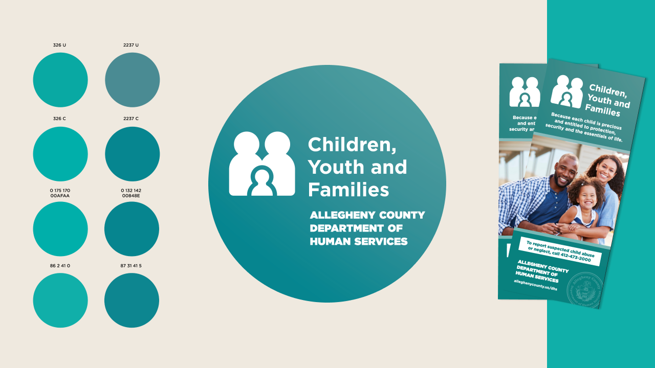
The team developed comprehensive brand architecture and governance for the agency and its five distinct sub-brands. This included full identity creation, logo systems, a unifying tagline, and a scalable, multi-platform brand guide. The work drove consistency across all channels—print, digital, and social—while addressing language translation and accessibility standards, ultimately resulting in a cohesive approach to public engagement.
Change perception and increase engagement with cohesive design.

Unify all five program offices under a single, cohesive visual identity.
Various services. One trusted organization.
Connecting People in Need with Services that Help.
Make finding resources and services easier.
Our primary goal was to simplify and centralize direct access to vital community services. To achieve this, our team designed and engineered Allegheny Connect, a full-service digital hub.
The project involved a rigorous user-centered process that included comprehensive content audits, strategic discovery sessions with target users, in-depth design workshops, and iterative user testing, culminating in the final web design and build.

Real Progress, Real Impact
Increase in consistency:
To ensure brand consistency and recognition, we developed a centralized tool by launching a SharePoint-based brand hub, which provided all staff with direct access to critical assets, including brand usage guidelines, approved logo files, official color specs (HEX codes), licensed imagery, and typography resources. This system effectively democratized access while maintaining visual integrity across the organization.
Increase in understanding:
The detailed brand guidelines were designed not just for adherence, but for organizational understanding and empowerment.
Recognizing that not everyone is a designer, we strategically framed the documentation to educate staff on the 'why'—showcasing the crucial role that consistent application plays in maintaining the brand’s integrity and recognition.
Building trust and familiarity:
The brand successfully permeated the public sphere, achieving consistent recognition across all outward-facing channels, including advertisements, community events, and fundraising efforts. This heightened and consistent visibility was essential: it validated the organization as a credible and trusted source of help, ultimately strengthening the critical relationship between the community and the services available.