Halloween: A Classic Masterpiece of Design
If you’re like me, October brings the happy anticipation of blue skies and cooler weather, the smell of autumn leaves, and the occasional need to hold my breath while watching a horror movie—usually alone, in the dark, and at some off-hour while my kids are asleep.
I always kick off Spooky Season with the infamous Michael Myers in the 1978 classic, Halloween.
As I settled in this year for the kick-off in terrifying myself on a regular Tuesday, I started thinking about what makes this particular series so uniquely eerie. The answer, you guessed it, is the sheer power of its creative design.
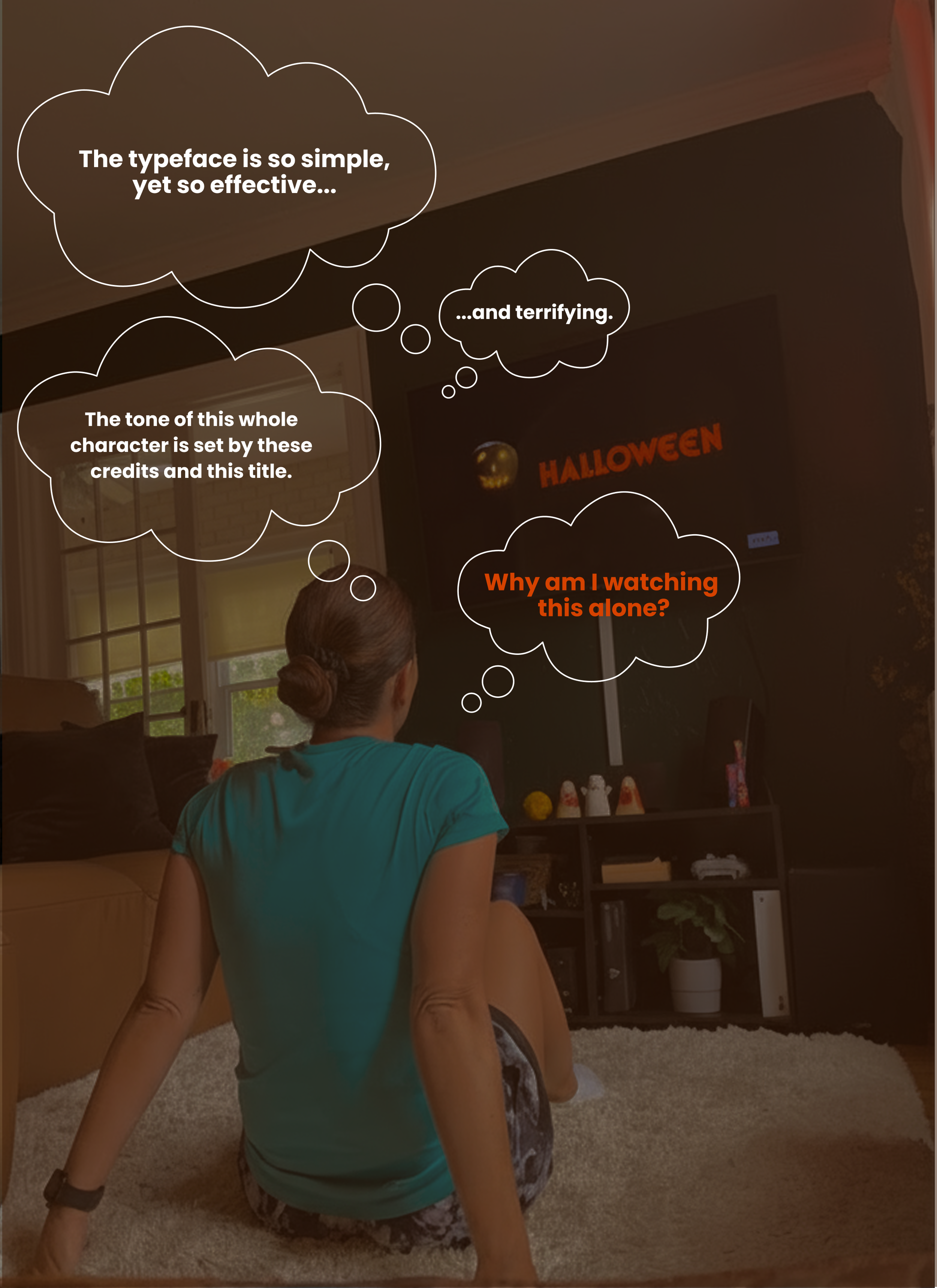
Pictured above: Me, on a rainy Tuesday, scaring myself.
The Typography: Quiet Power
The title is instantly recognizable, yet it achieves its terror without relying on exaggerated letters, spiderwebs, or dripping blood effects we see these days. Instead, its superpower of evoking that hold-your-breath feeling comes from the elegant strength of a single, fantastic typeface: ITC Serif Gothic.
This font is considered a hybrid of horror and style, designed in 1972 by Herb Lubalin and Tony DeSpigna. It was an intentional and revolutionary choice. It marries the clean, modern simplicity of Gothic (sans-serif) letterforms with the sharp, pointed details of a serif font. The letters are heavy, condensed, and powerful. The distinctive, sharp serifs (the small "feet" on the letters) lend the typeface an oppressive, slightly gothic, and unquestionably creepy feel. This typographic choice perfectly embodies the killer himself. It’s quiet, strong, and unexpected, establishing the chilling aesthetic that defines Michael Myers’s relentless menace.
The Colors: Seasonal Psychology
It’s easy to think "orange" for Halloween, but the color palette used in the film's titles is deliberate, blending seasonal themes with classic horror psychology for maximum impact.
The iconic jack-o'-lantern in the title sequence immediately sets the seasonal stage with its glowing hue. The title text is often a bright, glowing orange that sometimes slowly fades into red. This subtle transition acts as a powerful visual warning of the violence and danger about to occur. The straight-forward, high-contrast black used as the background creates an essential tension. It gives the viewer that someone-is-lurking-behind-you sensation, symbolizing the deep, absolute darkness and the terrifying void of humanity in the film's main character.
The Music: Flawless Execution
I’m not sure I even need to expand on this. Once those instantly recognizable piano keys begin, it’s almost impossible to not think about Halloween. The classic, simple theme composed by John Carpenter marries perfectly with the clean simplicity of the typeface and colors. There is no fluff needed here; the design elements and the score work together to form a truly perfect piece of cinematic terror.
The creative execution of this series set a tone that dictated our emotions and informed the design of countless horror sequels that followed. It’s a powerful reminder that sometimes, the simplest visuals make the deepest cut.
BRB, off to watch the sequel. Maybe with someone this time.